
Worst. Super Bowl Uniforms. Ever?
How NFL uniforms got objectively worse, and why no one will admit it.

This is Throwbacks, a newsletter by me, Michael Weinreb, about sports, history, culture, and politics—and how they all bleed together.
If you like what you read, please click the button below, join the mailing list for FREE and please share, on social media or through e-mail or however you feel comfortable sharing.
And if you’ve been reading for a while, please consider joining the list of paid subscribers to unlock paid posts and allow me to expand Throwbacks’ offerings.
Here’s a link to get 20 percent off a monthly membership for your first year:
And here’s link to get 25 percent off an annual membership:
(If you cannot afford a paid subscription and would like one, send me an email and I’ll comp you one, no questions asked.)
I.
Let’s just start here:
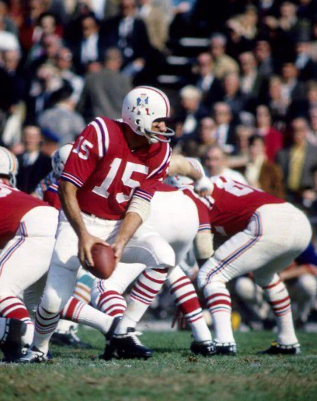
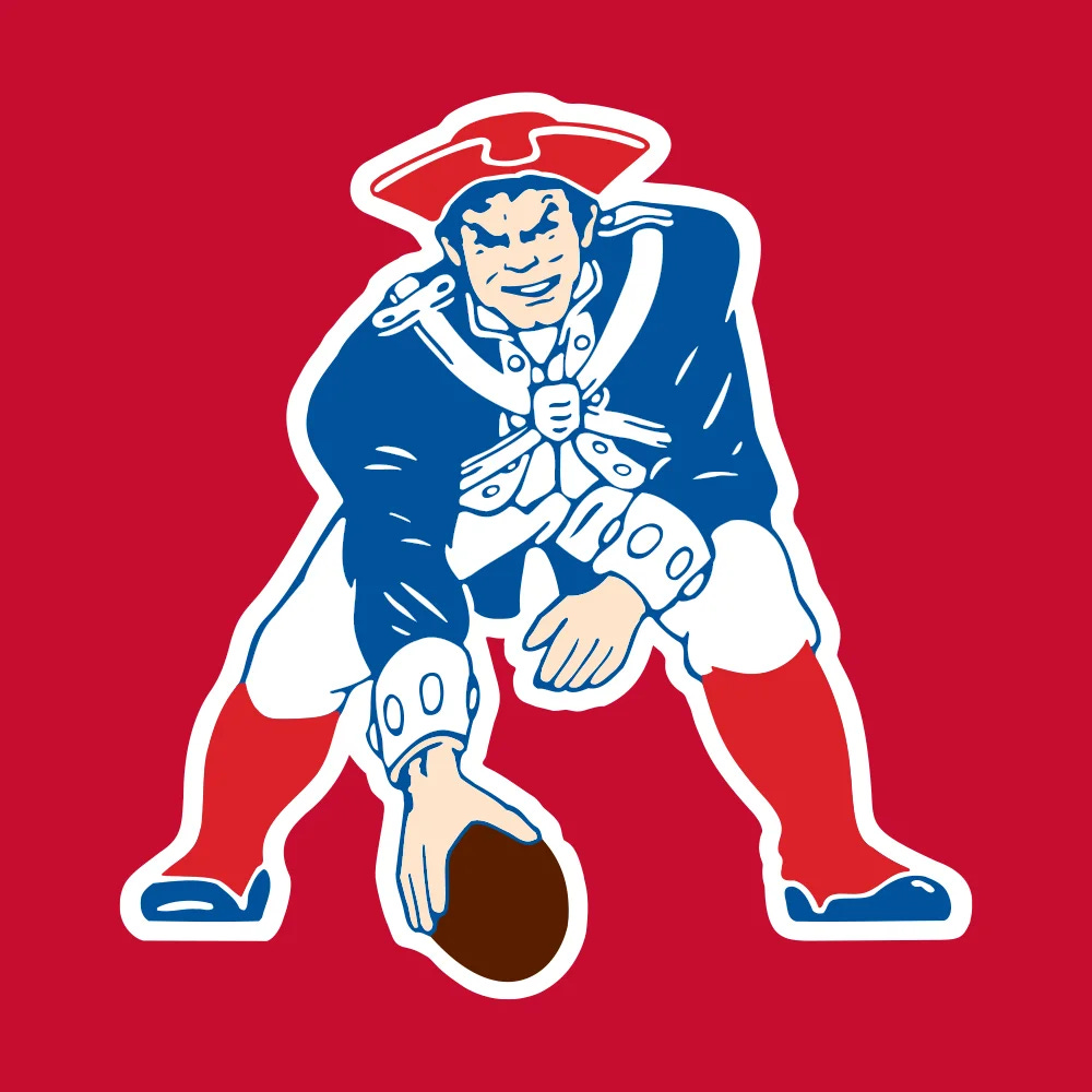
Those are the uniforms of the Boston Patriots in the early 1960s, back in the nascent era of the American Football League, when a league desperate for attention assaulted our eyes with color. For years, that design remained the essence of the Patriots’ look. It was the platonic ideal of what a football uniform should be. You look at those things and can hear the fifes playing as Peter Coyote narrates a passage about Samuel Adams. There was no reason to ever fundamentally alter them, except that the Patriots eventually decided to mess with perfection. And that led us to the abomination known as the Flying Elvis.
Now, it is hard for me to believe that anyone actually thought this was ever a fundamentally better design, because it is not. The Sons of Liberty did not hurl tea into the Boston Harbor so we could watch Blue Hawaii on TCM; they exercised their rights of protest with the dream that someday, a man in full revolutionary garb known colloquially as Pat Patriot would step up under center for a middling second-tier franchise. But something happened in the late 1990s and early 2000s, which is that NFL teams began stripping their uniforms of actual color in favor of a metallic look which felt less like Keith Haring and more like George Patton. And that led the New England Patriots to this:
Never mind your emotional connection (or lack thereof) to the Patriots. Those uniforms are objectively terrible, and every Patriots uniform of the 21st century has been terrible ever since, laced with the kind of bland metallic shades that make a Bill Belichick press conference feel like a Spalding Gray monologue by comparison. Honestly, it wasn’t that the rest of us disliked Tom Brady; it’s that he went out on the field every week dressed like he’d bought the cheapest suit off the rack at the Hugo Boss outlet.
The Patriots uniforms are ugly and discursive, and the Flying Elvis remains an entirely inexplicable insult both to our founding fathers and to Graceland. The reason this look has survived is twofold: First (and perhaps most important), the Patriots started winning when they began to wear those uniforms on a regular basis, and so superstition took precedent over aesthetics. And second, something strange happened to NFL uniforms at the dawn of the 21st century, and we’re still working our way back from the terrible nadir of that moment.
II.
I’d never really thought much about why NFL uniforms got objectively worse around the turn of the century. I just assumed I was a victim of my own nostalgia, and that tastes changed and millennials inherited the trappings of a Gen X world and decided to ruin everything. But then I read this fascinating (and almost pathologically detailed) polemic entitled A Political History of the NFL Jersey, which argues that there was a larger purpose behind it all. Writes author Justin A. Davis:
Over the next 15 years, a number of teams revamped their jerseys again. They tended to move from brighter shades to darker, more metallic ones…Some of these choices were driven by the corporatization of jersey design and production…But the sleek, dark futurism that gripped pro football in this period reflected the growing importance of digital culture and the technological leaps made lethally evident during our wars in the Middle East. The NFL’s emphasis on visual branding also helped drown out critiques of these wars as the league took on an increasing role as a private propaganda arm for the military.
That is quite a profoundly Chomsky-ian statement about the Tampa Bay Buccaneers abandoning their creamsicle uniforms, and I’m not sure if I’m entirely on board with it. But it does get at the larger notion that something happened in the early 2000s that led teams like the Patriots to abandon the revolutionary boldness of those red uniforms for the bland aggression of the Flying Elvis era. And everything’s been out of whack ever since. Teams now attempt to marry bold colors with that ugly militarized design, and what comes out the other end are some of the worst design choices of the modern era.
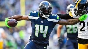
Those are the uniforms of the Seattle Seahawks, and good lord, are they are a mess. They are an attempt to replicate the overcaffeinated lunatic fringe pioneered by the Oregon Ducks in college football, but at least the Ducks were attempting something original. The Seahawks are like a shitty punk band attempting to replicate the sound of The Ramones. There is nothing interesting about these uniforms at all, and every so often, in order to make us believe they are actually quite interesting, they choose to bombard us with the inexorable memory of what it felt like to highlight an economics textbook in college.
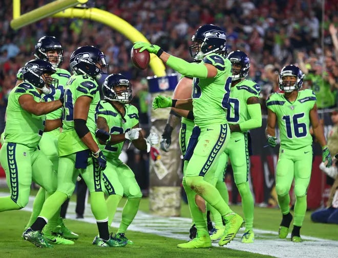
This is something that no one asked for, but here we are. And everyone knows that the Seahawks uniforms were far better before they decided to allow Nike to assault our senses…
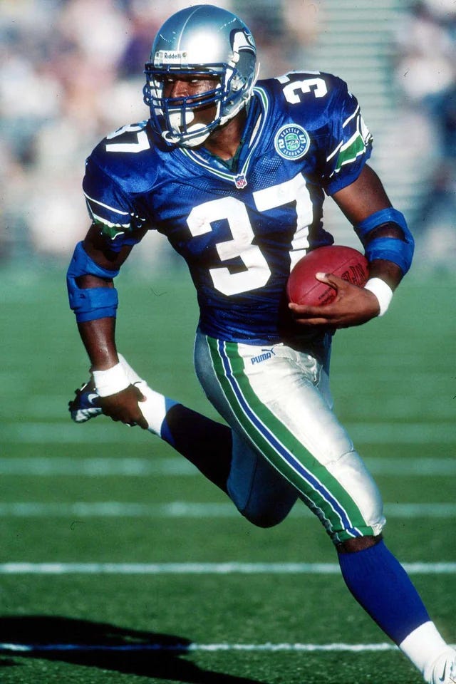
…but there is no going back, in part because the Seahawks are now a far more competent franchise than they were in the 1980s, and in part because it would be an admission of their own aesthetic failure.
III.
And so we arrive at Super Bowl LX burdened with arguably the worst uniform matchup imaginable. The idea that uniforms can be saturated with color and viewed as artwork has given way to the idea that uniforms and primary shades have to have to be tougher and more militarized—that somehow, bright colors are correlated with a lack of masculinity, and therefore a lack of winning. Everyone knows the Philadelphia Eagles look better in kelly green than in dark green, but they refuse to admit it and just go back to the kelly green full time, in large part because they’ve recently won two Super Bowls with dark green. Everyone knows the Bucs look amazing in orange, and that they look drab and uninteresting in that modern-day metallic clutter, but orange is tied to an era when the Bucs lost a lot of football games, so we have to play this charade.
There are, of course, exceptions to the rule—the Los Angeles Chargers foremost among them—who have veered in the opposite direction and embraced the spirit of the original American Football League. But for the most part, we are stuck in this netherworld where no one wants to admit that the last 25 years or so of NFL uniform changes have been marred by one creative mistake after another. And that leaves us with a Super Bowl defined by a sleek, dark futurism, marked by the kind of sartorial overreach that feels like a metaphor for the A.I. era.
Sometimes, nostalgia can be misplaced. But sometimes, as in this case, it is absolutely correct. Perhaps it is time for an apparel-driven revolution. And I know just the dude to lead it, because he’s got plenty of time on his hands these days.
This newsletter is a perpetual work in progress. Thoughts? Ideas for future editions? Respond to this newsletter, Contact me via twitter or at michaeliweinreb at gmail, or leave a comment below. If you enjoyed this newsletter, please join the list and/or share it with others.
Let's blame Nike and Oregon Ducks with this ever-revolving costumes, as if they were a Broadway musical and not a football team. How many uniform variations did, for example, did the Philadelphia Eagle employ this season? White, Metallic Green, Black, Kelly Green? In 18 games (not including preseason, where nobody gives a shit), they probably wore the same helmet/jersey/pants combination maybe three times, and those where when they blessed us with the old Kelly Green look. And let's not even talk about the atrocities of the City Editions uniforms in baseball and basketball. It's all a marketing/merchandising ploy. There was a time not too long ago when a team wore throwback uniforms, it was a big deal. Now, it is so ubiquitous, it has become blase. If everything is "special", then by definition, noting is special.
Back in 1992, when the Seahawks and Patriots were terrible and competing for the top overall draft pick, this would have been one of the best Super Bowl uniforms match-ups ever.
Oh, how we have devolved as a society in 33 years.
/End of Mid-age Man rant.
The Los Angeles Rams' devolving into what they wear now is like ... they forgot they were Rams and became knockoff shoe logos.