


The Endorsement: 1975 Topps
The most colorful baseball card in history was also a harbinger of hope.

This is Throwbacks, a newsletter by me, Michael Weinreb, about sports, history, culture and politics, and everything in-between.
If you like what you read, please click the button below, join the mailing list for FREE and please share, on social media or through e-mail or however you feel comfortable sharing.
And if you’ve been reading for a while, please consider a paid subscription to unlock certain posts and help keep this thing going—you’ll also get full access to the historical archive of over 250 articles. (Click here and you’ll get 20 percent off either a monthly or annual subscription for the first year.)
(If your subscription is up for renewal, just shoot me an email and I’ll figure out a way to get you that discount, as well. If you cannot afford a paid subscription and would like one, send me an email and I’ll comp you one, no questions asked.)
I.
There is a blanket draped over the couch in our television room that I truly cannot imagine living my life without. It is an afghan that my late Aunt Yetta crocheted sometime in the 1970s, although I would not need to tell you what decade this blanket emerged from if you saw it, because it is woven in alternate shades of light brown, dark brown and burnt orange. My dog loves to burrow underneath it, perhaps to shield herself from its ugliness, and my partner finds it endlessly kitschy, but I do not even register its unsightliness anymore. I only see a blanket that has been around so long and traveled with me to so many places and been with me through so many key moments in life that it feels like a vestigial extension of myself.
Aunt Yetta’s blanket is an artifact of an era when color itself became a statement. It is a product of a moment when the country was suffering through a malaise and American institutions were crumbling—when a president had resigned from office and inflation was ramping up and a failed war had come to an end—and people reacted by embracing a sense of individuality that took decades of perspective to fully process. For a long time, people mocked the ‘70s as aesthetically and culturally ugly, an era when the country became obsessed with earthtones and its own ego. But while I was too young to remember much of the decade myself, it increasingly feels like the 1970s were a crucial and resonant time in America, a moment when we struggled with who we were and fought over what we wanted to be. And by embracing that sense of individuality, we eventually made it out.

II.
Imagine being a kid fifty years ago this summer, and imagine walking into a K-Mart or a Woolworth’s or some grungy local corner store that reeked of dust and newsprint, and imagine plunking down some spare change you earned by mowing lawns and purchasing a wax pack that looked like this:

…and then imagine tearing that wax pack open and gnawing on a piece of stale gum as you got your first glimpse of a baseball card that looked like this…
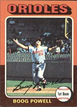
That is Boog Powell of the Baltimore Orioles, engaged in either calling off his teammates for a pop fly or—as seems more likely—shouting out helplessly as a fly ball gets obscured by the sun and wondering if he is about to embarrass himself in front of thousands. Boog Powell is lost and fearful and maybe a little screwed, but hell, who wasn’t lost and fearful and maybe a little screwed back then? Who were we anyhow? Who were we meant to be? Did it even matter if Boog Powell caught that baseball or not?
Behind Powell, the stands are half-empty; as the legendary baseball writer Thomas Boswell recently noted, in 1975, the sport was at the tail end of a three-decade mid-century stagnation where average attendance dropped to roughly 15,000 per game. But of course I am burying the lede here, to cop a journalistic phrase, because the most incredible element of this card is the design. Everything about it is stunningly unique and of the moment, from the shadowy ORIOLES font to the Me-Decade signature scrawled across the bottom to the sketched seams on the baseball that make it appear as an animated vision of what a baseball might look like if someone threw you a slider after you’d swallowed a tab of acid and watched a double feature of The Wall and Heavy Metal.
But the coup de grace, of course, are the borders (which in this case, are the exact shades of my Aunt Yetta’s afghan). I do not know who at the Topps company was responsible for these border designs, but I believe it is the most brilliant attempt to capture the Zeitgeist in baseball-card history. It is a truly staggering work of pop-art; it is Warholian in scope. If the 1952 Topps set is a stunning Rockwellian vision of post-war America, the 1975 Topps set is a color-washed acknowledgment of our own confusion. There has never been anything like it, before or since, this surreal combination of pastels and earthtones and facial hair:

Years ago, a blogger named Night Owl compiled a tally of each border color in the 1975 Topps set, and came up with this:
1. Green-light green: 55
2. Green-purple: 55
3. Orange-brown: 55
4. Pink-yellow: 55
5. Purple-pink: 55
6. Yellow-red: 39
7. Brown-orange: 33
8. Green-yellow: 33
9. Light blue-green: 33
10. Orange-yellow: 33
11. Red-orange: 33
12. Yellow-light blue: 33
13. Blue-orange: 22
14. Brown-tan: 22
15. Red-blue: 22
16. Red-yellow: 22
17. Tan-light blue: 22
18: Yellow-green: 22
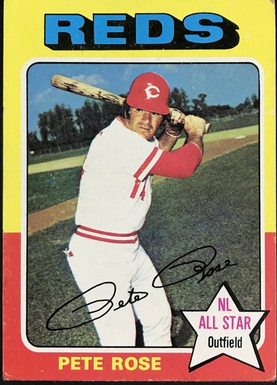
One of those purple-pink cards was this one, perhaps the most brilliantly trippy baseball card ever created, a work of art that (unlike Pete Rose) is worthy of a spot in the Baseball Hall of Fame, no questions asked:

The surreality of the 1975 Topps set did not end at its borders. For some reason, that same year, Topps also issued a mini version of this set. They were the exact same cards, but smaller. Why did they do this? I guess it was a commercial experiment to see if they could get away with using less cardboard, but honestly, it seemed like the kind of wacked-out artistic statement that Lewis Carroll would have admired. Life felt tenuous and uncertain and the best way to escape was to take off like Herb Washington, a man who was not even an actual baseball player, but who had been hired by an iconoclastic owner in Oakland simply to scramble down a rabbit hole of his own making.
III.
Turns out baseball was on the verge of a renaissance in 1975. Things were about to come back; the country itself was at the onset of a slow and unsteady healing process. “In the 20 seasons from 1975 to 1994, attendance doubled to 31,256,” Thomas Boswell recently wrote. “I covered that period, and there were multiple reasons. But I’m certain of one factor: MLB’s aesthetics in those boom years pleased most fans.”
Boswell was largely referring to the way the game was actually played; the way it moved quickly and embraced its complexities without being reduced to an all-or-nothing contest of home runs and strikeouts. But I think he also could have been extended this metaphor to the literal aesthetics of baseball, which were awash in the strange and the colorful.

Like Boswell, I believe that baseball is on the verge of an on-field revival (see the link above). But in order for it to regain its cultural importance, I think it has to embrace those 1975 Topps aesthetics once more. It has to be bold; it has to acknowledge, without directly acknowledging, that America is once again in a strange and confusing place and that the way out is to embrace who we truly are, even if some might find it ugly. The most recent City Connect uniforms have begun to spin the sport back in that direction…
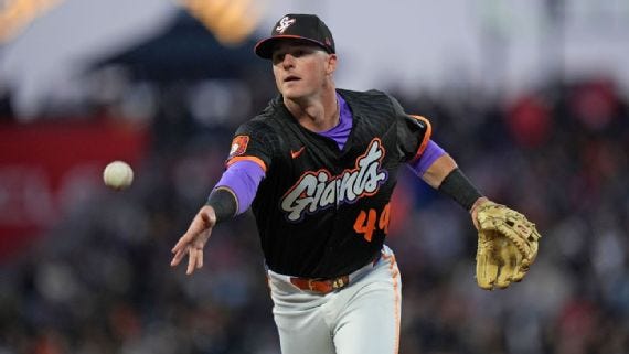
…but I think there is room to grow. This is the 2025 Topps card of the best player in baseball…

…and it is almost alarmingly devoid of color. While there was clearly artistic thought put behind it, I wonder if its simplicity won out because baseball cards have become commoditized to the point that no one wants to take the chance on bold colors anymore. The only way for baseball to truly become cool again is for it not to give a fuck about any of that stuff; the only way for baseball to recapture the public imagination is for it to let its freak flag fly. Embrace the surreality of the moment; embrace the wild aesthetics; embrace the uncertainty. Let those colors run free, and see where it takes us.
This newsletter is a perpetual work in progress. Thoughts? Ideas for future editions? Respond to this newsletter, contact me at michaeliweinreb at gmail, or leave a comment below. If you enjoyed this newsletter, please join the list and/or share it with others.
Wonderful review of a decade many prefer to abandon. As an 11 year old that summer of ‘75 you captured the essence of the era I recall. Selfishly, I’ll contend that baseball’s renaissance, which you astutely cite as commencing that summer, was due in large part to our magnificent Cincinnati Reds and the most remarkable of World Series ever played that fall against the Red Sox. Thanks for the wonderful account of the time!
Yes! Emphatically yes!